Developing UI with Testing in Mind
In web development, testing is not just about ensuring functionality; it is also about guaranteeing a seamless user experience and accessibility. This article outlines essential practices for upholding these standards at the foundation stage.

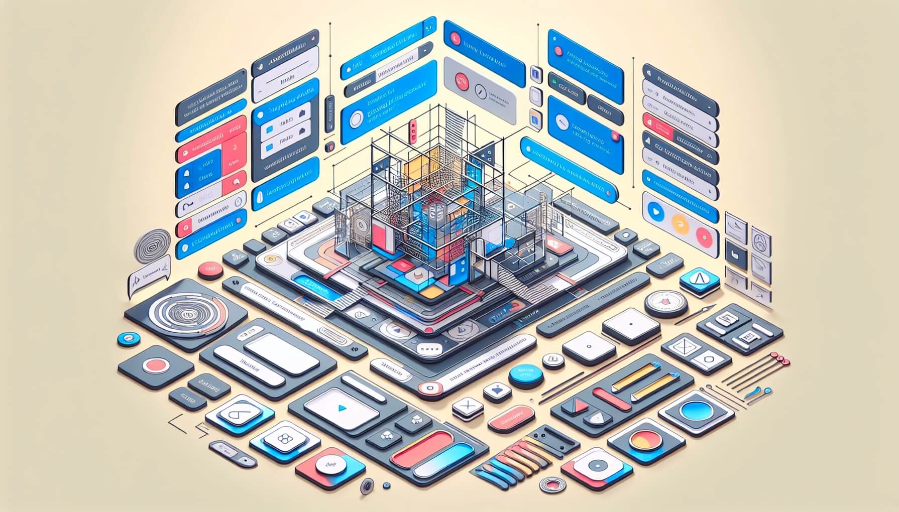
DALL-E 3 prompt: create a design system for a modern web interface with accessibility features, buttons, alerts, notifications, backdrops, hints, loaders, progress bars, and skeletons. Use a bright color palette with mesh gradients
In my current project, I work not only as a test engineer but also as a web developer, creating some UI components that I have to test by myself simultaneously. Suddenly, taking into account the tester’s background, you have to consider many things that are missing from the design mockups but which will be revealed at the testing stage.
The following tips will help deliver an intuitive and seamless user experience when developing UI components:
- Providing a meaningful visual clue;
- Do not hide the outline;
- Enhancing interactive elements;
- Feedback on user actions;
- Implementing error handling from the backend;
- Closeable pop-ups and notifications;
- Ensuring forms usability;
- Maintaining visual stability;
- Sticking to unambiguity
- Maintaining overall consistency
- Testability of elements
- Prioritizing accessibility features
1. Providing a meaningful visual clue
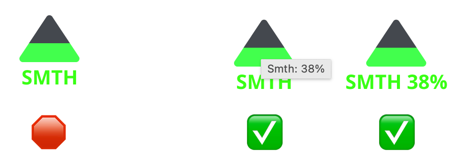
Color-coded pictograms and icons should not rely solely on color to convey information. They must have a title or an alt text description with its value because:
- Users may not distinguish color (accessibility issue);
- Users may not trust a color code (some technical users want to see real data instead of a «friendly interpretation» of the data).

Fig. 1. On the left: something’s value is only color-coded; on the right: the icon has a title with the value, and the value is specified in the description
Keep in mind that all users, including those with color vision deficiencies, should effectively «read» the interface.
2. Do not hide the outline
Unfortunately, mostly due to ignorance, some developers and designers argue about hiding outline styles by saying that this is «ugly». However, retaining an outline on the focused element aids users in understanding their current place on the page, offering valuable context and improving overall usability.

Fig 2. The default outline
Moreover, the **outline style can be changed, **and its behavior can be configured separately for mouse and keyboard navigation by focus and focus-visible CSS classes.
/* It draws the focus ring around the button when the user navigates to it with the keyboard */
button:focus-visible {
 outline: 2px solid #0069c2;
}
Keep in mind that outlines serve an essential function in user navigation, particularly in multi-button interfaces.
3. Enhancing interactive elements
Interactive elements should be intuitively highlighted in some way when in focus:
- Buttons should change color or shape;
- Links should change color and/or underlining;
- The mouse cursor should change the shape on clickable elements to a pointer. This point is contradictory for buttons but unambiguous for URLs. According to the definition of the pointer: «the cursor is a pointer that indicates a link».

Fig. 3. [Yes] button changed color after hover, and the mouse shape has the pointer hand
Keep in mind that interactivity provides visual feedback to users navigating the interface via keyboard or mouse.
Read more:
- Into to UI Cursors;
- Two opinions: «Buttons shouldn’t have a hand cursor» and «On the web, maybe buttons should have a hand cursor».
4. Feedback on user actions
Every user action should evoke a corresponding feedback response, indicating that the action has been initiated or is in progress. This ensures users are not left in the dark, providing reassurance and clarity throughout their interaction with the interface.
It can be a special state of the button or the whole intractable component or some kind of alert or notification after a click. There are a lot of feedback components that can be used: alerts, notifications, backdrops, hints, loaders, progress bars, and skeletons.

Fig. 4. Example of feedback Notification in Mantine components library
Apple Human Interface Guidelines has Feedback’s best practices, which apply to the web.
5. Implementing error handling from the backend
This issue is similar to the previous one, but it is expanded beyond the client side here.
It is a good practice to alert users of any problems that may arise by backend responses. Valuable bad requests (4xx and 5xx status codes) from the backend should be processed and shown in some way (as hints or notifications) on the frontend.

Fig. 5.1. Example of React Alert in Material UI components library
Keep in mind that consistent communication between the backend and frontend ensures transparency and empowers users to navigate potential disruptions effectively.
Sometimes, it is helpful to display a detailed error message: status codes, error messages, request IDs, etc. This is absolutely optional information, but some responsible users are ready to report bugs with screenshots, and auxiliary information will speed up the debugging.

Fig. 5.2. Example of an alert with debug info
Of course, any alert display implies error logging in the background.
6. Closeable pop-ups and notifications
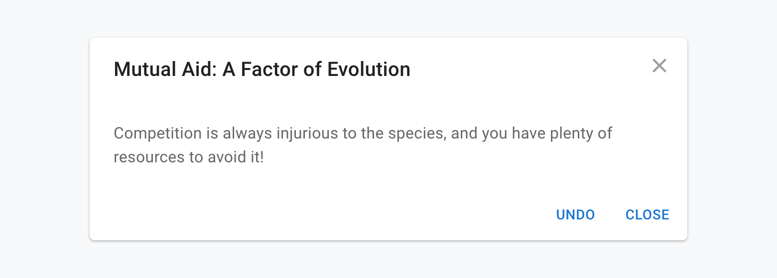
All pop-ups, overlays, and notifications, even if they are auto-closable, should have a closure cross or [Close] button and be in an accustomed place. [Close] button and [X] in one element are not redundant because different users have different habits and experiences.

Fig. 6. Example of Modal window in Material UI components library
In addition, closing the pop-up by [ESC] key will not be superfluous 😉
Read further:
7. Ensuring forms usability
There are a lot of articles about forms’ usability that my recommendations will be a drop in the bucket. During developing and testing forms, I often focus on the required fields. There can be two main cases with them:
- Disable [Save]/[Send] button until all the required fields are filled in. In this case, it should be an indication of why the submit button is disabled and all required fields should be marked.
- Upon attempted submission, highlight the blank or required fields. In this case, all previously filled fields should not be erased. And, of course, all required fields should be marked.
![Example of a form in Mantine components library. Required fields are marked, and the [Register] button is disabled, while required fields are empty](/assets/2024-05-13/07-register.png)
Fig. 7. Example of a form in Mantine components library. Required fields are marked, and the [Register] button is disabled, while required fields are empty
Read further:
- An Extensive Guide To Web Form Usability;
- Designing Efficient Web Forms: On Structure, Inputs, Labels And Actions;
- How to Design a User-Friendly Form;
- How to test forms for usability.
8. Maintaining visual stability
To ensure a smooth user experience, elements, particularly buttons and blocks of text, should not jump or shift unexpectedly when their state changes.

Fig. 8. Avoid unintended jumps and shifts
Keep in mind that divert shifts of UI elements distract the user’s attention.
9. Sticking to unambiguity
Avoid hidden behavior of interacting elements. Its name, shape, and appearance should demonstrate its unambiguous functionality.
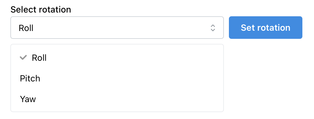
For example, a select element should be used only to select item(s) from the list (dropdown). Then, if the interface needs to process the choice made, there should be a separate button for this.

Fig. 9. The obvious user flow: select an element → action under selected one
However, if selecting a value in the select element is accompanied by the simultaneous execution of some action, it is unexpected and not apparent to users. — This is unusual behavior for a «familiar» element. Test engineers should recognize and alarm about the appearance of such elements in the interface.
10. Maintaining overall consistency
Almost last but not least, maintain the consistency of the components and their logic. If you have native checkboxes and selects on one page, do not invent a custom one for another page. If you use buttons to perform some actions, do not use buttons as links. All interactive elements must be combined with each other and perform the same function throughout the whole app.

Fig. 10. On the left: the [Read more] looks like a button but behaves as a link; on the right: «Read more» looks and behaves as a link
Keep in mind that your interface should provide clear feedback when users misuse tools or features, guiding them toward correct usage and preventing frustration. A tool that users use incorrectly should tell them that they are doing it wrong.
11. Testability of elements
This is a controversial item that depends heavily on the processes within the development team: who writes autotests? which framework is used? and so on.
Based on my experience, it is much easier (and cost-efficient) to commit to UI testing of each component at the development stage. Adding «anchors» of test IDs for locators for interactable elements (buttons, inputs, selects, etc.) is better in advance than later — your test automation engineers will say «Thank you» for that later.
<Button
 onClick={onOpenSmth}
 variant="light"
 title="Open something"
 data-testid="button-open-smth"
>
 Open
</Button>
Read further:
- Locate by test id;
- Testing Recipes (take a look at
data-testidattributes at examples in code snippets); - Why Your Development Team Should Use data-testid Attributes.
12. Prioritizing accessibility features
Finally, most of the issues discussed above are related to accessibility and usability in general. The same can be said about light and dark themes, but actually, color themes are more than just design trends but essential considerations for users with diverse needs.
A dark theme is crucial for users who work in low-light environments or constantly monitor something on a screen: air traffic controllers (or any vehicle controllers/operators), stock traders, and various system administrators. In contrast, a light theme is a must-have for those who use your app outdoors and/or in bright sunlight.
Read further:
However, in some rare cases of commercial development, accessibility is not needed, and its implementation can slow down development. That is why prioritization is important and dependent on the context or domain.
If none of the listed items were considered during the web application’s development, then test engineers will report dozens of bugs related to A11Y, UI, UX, and the app’s logic. Meanwhile, most of the problems can be resolved in advance by adhering to the practices discussed above.
Copy @ Medium